Showing posts with label art. Show all posts

Sunday, April 05, 2015

Art as social commentary

sun boat.jpgLawrence Ferlinghetti: Provincetown  (1995)

Legends of the Bay Area:
Lawrence Ferlinghetti
.
Marin Museum of Contemporary Art
500 Palm Drive, Novato, California
tel. 415-506—0137
W-F 11-4; Sa-Su 11-5; closes April 5
Mildred Howard: Spirit and Matter.
Richmond Art Center
2540 Barrett Avenue, Richmond, California
tel. 510-620-6772
Tu-Sa 10-5; Su 12-5; closes May 24
Eastside Road, April 4, 2015—
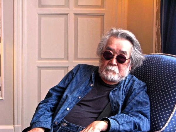
LAWRENCE FERLINGHETTI is locally famous — as poet, personality, and bookseller. His City Lights Books has been a nexus of literacy since the days of the Beat Poets: he counted Allen Ginsburg, Jack Kerouac, Gregory Corso and Michael McClure among his friends.

I knew that he painted, but always assumed that his painting amounted to something of a hobby. Hobby: terrible word. The French have a better expression, violon d'Ingres , referring to the music Ingres turned to when he wasn't concentrating on his primary art, painting and drawing. It's not uncommon for artists to work at two quite dissimilar genres, often one of them time-based — music, theater, poetry — and the other primarily visual: painting, sculpture.

The exhibition of Ferlinghetti's visual work, primarily painting but including also a few prints, suggests that he often confronts his work quite seriously, though he's quoted as saying "Painting is more like play than work." He began painting in Paris in the late 1940s, when he was studying literature at the Sorbonne, and has maintained a studio ever since coming to San Francisco sixty-odd years ago. (He is still painting, at 96.) The earliest work in this exhibition, Deux , recalls Cocteau; though a canvas, it's essentially a line drawing of two profiled male faces confronting one another, one upside-down, like the figures at the corner of a playing card.

Though he admired the abstract expressionism of the Beats, he found himself unable to resist representation, especially of the figure. (He dislikes the term "abstract expressionism," finding it a contradiction in terms.) His best paintings bear the scrubbed light of Ab Ex painters: Elmer Bischoff and Hassel Smith come to mind. The calligraphy of the framing inside the hull of the boat in Provincetown makes me think of Franz Kline, whose influence shows up elsewhere. But, staying with Provincetown , the two figures inside the hull again recall school-of-Paris painters; it's not a stretch to relate them back to the profiled faces in Deux.

The boat is a recurring motif in Ferlinghetti's painting; perhaps a memory of his own transatlantic crossing.
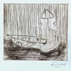
sun boat 2.jpgIMG_8845.jpg
Sun Boat 2 (2009)

In Sun Boat 2 the boat is little more than counterweight to the brilliant energy of the upper half of the canvas; in an untitled print (made at Crown Point Press in San Francisco) it forms part of a narrative, in a small piece whose elegance and wit is hard to resist. (The male figure reaching up out of the water will remind some of us of both Picasso and Picabia, but the piece is fully Ferlinghetti's.)

Mother Russia.jpgA number of the works here make comments of a social or political nature, and they seem to me the weakest work — rushed, blatant, obvious; more slogan than painting — though the 1999 Mother Russia , whose expressive face is defined with an artfully drawn hammer-and-sickle, and whose posture and tone recall the Russian qualities of Chagall and (Arshile) Gorky, is exceptional in this respect, quiet yet rather deep, "poetic" in its juxtaposition of signs (woman, bird), telling it the downward motion of the street.

At 96, Ferlinghetti is free from anxieties concerning position; his painting, like his poetry, stands on its own, a good member of a rich and vibrant society of artists, poets, writers, activists. This is a retrospective in more ways than one: the viewer can't help recalling the work of previous decades, can't help noting the inevitable vitiation of their movements, platforms, and insights. Yet the human spirit persists, and expression is the inevitable result. To Ferlinghetti's credit there's a fair amount of joy and beauty as well as occasional impatience with the social human condition.
The Painter (1989)
selfportrait.jpg

installation.jpg
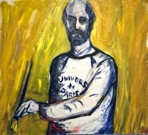
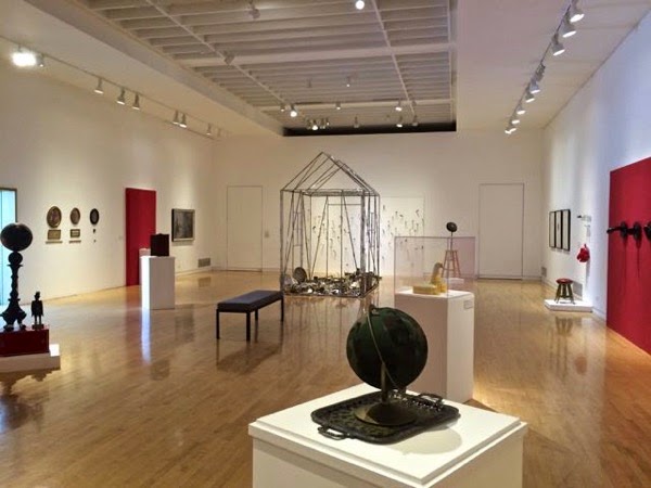
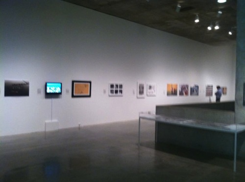
Installation, Mildred Howard: Spirit and Matter , Richmond Art Center

MILDRED HOWARD is an artist of considerable standing in an area — Northern California — not exactly hurting for powerful, mature artists. She has worked in collage, painting, assemblage, and sculpture for decades, always bringing to her work intellectual energy drawn from a sober, serious contemplation of self and society. I don't know any artist who excels her in treating the significance of being African-American in contemporary American society, or in treating the history of that situation, without bogging down in mere politics-of-the-moment. A "white," I can't of course speak from within that "situation": but it does seem to me the significance, the meaning, the roots and the reach of Howard's work must be the same to a black viewer as to a white.

It's curious: her work is intensely personal, sometimes using her own face and hand as the visual center of the work; yet the result transcends self. That wonderful critic R.H. Blyth writes, in his Zen in English Literature and Oriental Classics , of four types of expression: from top to bottom, as you might say, "the object treated objectively", "the object treated subjectively," "the subject treated objectively," "the subject treated subjectively." (His examples range from "almost all of Chaucer; Shakespeare's songs…" at the top to the "Chamber of Horrors" at the bottom: "The larger part of Byron, a great deal of Shelley and Keats… the pièce de résistance is Yeats' Had I the heaven's embroidered cloths/… Tread softly because you tread on my dreams.)

In this formula Mildred Howard often works, I think, with the subject the "black" presence in the American scheme) treated objectively. I have generally preferred objective objects, and this is why I like Puryear and Guston; but if you're going to make a career as an artist contemplating the significance latent in the intersection of self and society, you can't do that any more objectively than Howard does. She never complains or shouts or cajoles. She contemplates, as I say, and presents the material of her contemplation, and expresses its complexity and reality — its objectivity — as a matter of social fact.

skillet.jpg
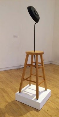
She also contemplates Art. One of the best pieces here, I think, and one of the best pieces of its type I've seen anywhere, is a tall four-legged unpainted wooden stool out of whose seat has risen a long-handled cast iron skillet. Skillet to the Frying Pan: Sitting Black , it's called — Howard's titles, often small poems themselves, are never to be neglected; they lead the viewer's mind into unspecified richnesses associated with the visual "meaning" of the pieces they name.

The visual reference includes Duchamp, of course; if like me you live with a copy of his famous Bicycle Wheel you'll greet Sitting Black with familiar pleasure. But at the center of the bottom of this skillet, angled up toward you as you lean in to look at it, is an old-time photographic portrait of an African-American woman, unnamed, unknown most likely unless a member of the artist's own family. Suddenly the gap, the gulf between everything Duchamp was concerned with and the history of the African-American presence in American society hits you like, well, a black iron frying pan.

Resonance; resonance. Yet the sculpture — and sculpture it is, there's no denying that — is beautiful, elegant, and aloof in its elegant beauty. If its size and proportions suggest a standing figure, it's a figure Joan Mirò might have conjured, with Giacometti somewhere in his mind. Howard treats this object of her own devising subjectively, to judge by the title, but she's reaching toward objectivity, and her work — her skill, patience, sophistication, and above all intelligence — permits us to follow her in completely resolving the subjective component to achieve a fully objective state of mind, contemplating the object without an agenda, without straining at a specific (let alone a socially charged) meaning.

Howard has been well known for a series of pieces referring to House; two are present here. In the installation photo you can see one playing domesticity and edge: the empty geometry of the house is made of channels of aluminum, I believe, completely covered on every surface with table knives. The floor is littered with an amazing collection of silver — candlesticks, compotes, candy-dishes, trays, pitchers — ultimately forming a path leaving the house toward the gallery wall, covered with white wallboard into which dozens of knives — sharp knives, not tableware — have apparently been stabbed, perhaps thrown, in gestures which can be interpreted as either violently aggressive or merely — merely ! — futile and frustrated. It's a big, complex, finally irresolute piece, I think: objectively subjective, perhaps.

bottle house.jpgIn an adjacent hallway there's a small example of Howard's bottle houses, cabins made almost exclusively of bottles. This one is small, made of dozens of identical brown glass bottles each holding only an ounce or two of… I don't know what, originally: the label mentions beer, but these look more like vanilla-extract bottles. Whatever they are, they are of course as beautiful as glass: perfectly uniform in color and texture and size, with the inert regularity of manufactured components — brick, tile. Lean into the open end of this bottle house and admire the light it admits.

This is a big show, a very important one; a mid-career retrospective presenting an artist who has quietly staked out for herself an uncommonly intelligent, probing, thoughtful position on art, self, and society, and expressed that position with unusually prolific, clear, consistently elegant, and often joyous work. I looked at this show thinking of great Richmond Art Center shows of the past, of Tom Marioni's direction in the 1960s, for example. Everyone involved with the show, its installation, and its curation is to be congratulated.
NO VISIT TO THE Richmond Art Center should overlook the marvelous folk sculpture tucked away, almost unnoticeably, in the shrubbery of the courtyard. They make a particularly poignant counterpoise to Mildred Howard's retrospective. I'm embarrassed and ashamed that I don't know who made them, and it's late Saturday night, I can't call to find out before putting up this blog Sunday morning — I'll try to rectify this in a later correction.

benvenuto.jpgThere's one other piece of sculpture in that courtyard, and I'm really unhappy about its treatment. It's a beautiful, formal, abstractly geometrical work in marble by the Italian-American San Francisco sculptor Elio Benvenuto. I knew him, casually, back in the 1950s I think: a tall, slender, elegant, courtly man with a fine eye and hand, a true heir to the Italian sculptural tradition.

This piece should be indoors, on a stand lifting it well off the floor, where the viewer can take his time with it, on its terms, letting light play across its polished surfaces, bounce off its edges and details. Instead it's on the ground on raw dirt, in shadow, at the edge of a concrete pavement, for all the world as if has been rejected, abandoned with no thought at all to its beauty, let alone the skill and dedication of the artist who made it.

Come to think of it, Benvenuto's position, seventy years ago, as an Italian immigrant bringing the artistic values of his society to the San Francisco Bay Area, is somewhat analogous to Mildred Howard's. And to that of the temporarily anonymous maker of the charming yet poignant cement sculptures nearby. An exhibition presenting work by the three artists together would be a fascinating depiction and examination of the urges and preoccupations they hold in common.


Thursday, December 18, 2014

Haring and the ancients

•Keith Haring: The Political Line.
  Through February 16, 2015.

•Lines on the Horizon:
  Native American Art from the Weisel Family Collection.

  Through January 4, 2015.
M.H. de Young Memorial Museum,
  50 Tea Garden Drive, Golden Gate Park,
  San Francisco; 415-750-3600
Eastside Road, December 17, 2014—
117_Untitled Self Portrait_1985_Sachs_PA.jpgKeith Haring (1958–1990)
Untitled (Self-Portrait), February 2, 1985
Acrylic on canvas, 48 x 48 in. (121.9 x 121.9 cm)
Private collection
© 2014, Keith Haring Foundation
Plate rabbits.jpgPlate (opposing rabbits), ca. 1010–1130
Mimbres
Earthenware with pigment
3 9/16 x 6 11/16 x 9 1/4 in. (9 x 17 x 23.5 cm)
Gift of the Thomas W. Weisel Family to the Fine Arts Museums of San Francisco
2013.76.90

WHAT A FASCINATING contemplation of contrasts, these two exhibitions! And yet there are common threads, I think, latent though they may be, which makes the visit particularly moving. On the most perceptual side, that thread is linearity — lines of imagery and design; more metaphorically, linearity of development. (Perhaps the exhibition titles were meant to recognize that.)

On a less perceptual side, there's a link of regret — that particular kind that comes in contemplating irrecoverable loss. The incredibly prolific and immediately popular Keith Haring died far too young, of complications related to AIDS, in 1990, only thirty-one years old. And the native American work, of course, represents cultures now gone entirely, a thousand years ago or more recently. (Of course the traditions continue in work, even excellent work, being done today: but the cultures expressed in this exhibition are gone forever.

In the case of Haring another cultural loss occurs to me, not a real one but one constantly threatened: the loss of depth and significance to immediacy; specifically of artistic expression, whatever that is — let's beg the question for the moment — to market agendas. I almost didn't go to the Haring show; of all things it was a short review in the newspaper that influenced the decision, pointing out that the effect of work seen "live" quite displaces that of its all too frequent reproduction. The review suggested this was a function of scale, and some of the paintings here are very big indeed. But it's not only scale: it's the energy of the work that needs to be experienced: energy of drawing, of gesture, of color, of figure-ground, of weight.

Two of the paintings persuade me that Haring was meant to be a very important painter of his time, even of his century: Moses and the Burning Bush (1985) and Walking in the Rain (1989). Nearly all Haring's work can be read for political position, but Moses has what is for me a bigger, deeper implication. It addresses the urgent and eternal forces that lie behind transient desires. Politics is always for the moment, an expression or an activity at a given time toward a given result. Very occasionally a political expression touches deeper issues, perhaps even universal and if not eternal then at least epochal. Goya comes to mind here, and I think Haring's Moses comes close to that degree of depth and intensity. It's as if the existential anguish behind Haring's evident cynicism and scorn is confronted, for once, itself.

As to Walking in the Rain, there's a dual-level linearity here, one composing the figure, the other the ground, that seems to stand for a confrontation of immediacy and timelessness. The technique and imagery are handled so well the confrontation seems almost resolved; the artist leads us to contemplate both, simultaneously. The resulting connection of the individual subject and his condition which is shared by all is all the more poignant. For me, too, both the imagery and the title bring Max Ernst to mind: there's no immediate equivalence, but Haring's allover figuration (which is not at all nervous, merely energetic) recalls Ernst's decalcomanie, and the title recalls Ernst's Europe after the rain.

Haring's paintings, sculptures, and drawings are distributed through a number of rooms, and take time to take in. Along the way, other artists came to mind: Willem de Kooning for his color, energy, and sometimes anger; Philip Guston for the mystery and arbitrariness of his vision; Matisse for the frequent classical simplicity of thick line and the formalism it conveys, Ernst and Goya as I've indicated; even Hieronymus Bosch for his apocalyptic expression of the inescapable commonplace vulgarities of life. I don't think Haring could have worked without these predecessors, without even a conscious awareness of them.

Haring is an essentially urban, even metropolitan artist. To my taste he was too often distracted by the seductive demands of the market: but you could argue that that market is the fertile soil of his inspiration, that his ubiquity in the popular visual clutter of his time is a proper return, like taking table-scraps back to the garden in compost. Even his by-work is nutritive and remarkable, like that of the Surrealists. I think, finally, that he is two artists in one — the glib, commercial, totally accessible post-pop maker of multiples and statements, standing somewhere between Roy Lichtenstein and Jeff Koons; and the intelligent, deep, ultimately tragic inheritor of Abstract Expressionism. This is a very important show.
A396674_V1_hero8.jpg
Attributed to Nampeyo (Hopi-Tewa, ca. 1860–1942)
Vessel, ca. 1890–1910
Earthenware with polychrome
2 15/16 x 10 1/16 in. (7.5 x 25.5 cm)
Gift of the Thomas W. Weisel Family to the Fine Arts Museums of San Francisco
2013.76.38
ringtail.jpgVessel (ring-tailed cat), ca. 1010–1130
Mimbres
Earthenware with pigment
3 1/4 x 8 1/4 in. (8.2 x 21 cm)
Gift of the Thomas W. Weisel Family to the Fine Arts Museums of San Francisco
2013.76.158
EXHILARATING, PROVOCATIVE, and ultimately satisfying as the Haring exhibition was, however, simply entering the exhibition of Native American art from the Weisel Family Collection was literally breathtaking. The first piece I chanced to look at was this vessel by the Hopi-Tewa potter Nampeyo, perhaps a century old: the energy of the deep polished background, combined with the abstraction of the imagery, so certain and aloof as to be utterly objective, continued the preoccupation with dualities that Haring's best work had evoked.

Adjacent, though, were a number of Mimbres ceramics from up to a thousand years earlier, and one's sense of scale and scope and universality was immediately overwhelmed. Words cannot convey the serenity and permanence these works have attained. Part of this effect must be attributable to the inherent fragility of the medium. Some vessels have been broken and pieced together; others have had holes knocked into their bottoms, symbolic of their surrendering utility to meaning I suppose, most likely at the time of their burial.

Some, most improbably, seem to be intact. What strength: of material, of purpose; of intent. Everything about these pieces — material, form, volume, color, line, balance, imagery — everything feels completely achieved. These wonderful pieces from a thousand years ago are the Cycladic sculpture of our continent. These photographs barely convey their presence: the imagery, the lopsided form, and the darkened white all give them a false sense of familiarity. Whatever its original purpose, a piece like these is no longer a quotidian thing; seen in person it has the enigmatic immediacy of a fine African tribal mask or, to my kind of comprehension, a late Philp Guston painting, or a musical composition of Giacinto Scelsi's.

These works, and the others in the exhibition, honor the donation from the Weisel Family Collection of some 200 objects to the de Young, including more than fifty pieces of Mimbres ceramics, a stunning accession. Many of the works are much more recent, but little less significant. There are two Navajo First Phase chief's blankets, from the first half of the 19th century, whose austere, bold surfaces are an eloquent response to the ancient ceramics.

blanket.jpgA396764_hero.jpg
Ledger drawing, ca. 1880
Cheyenne (Tsitsitsas)
Colored pencil on paper
7 1/4 x 11 7/8 in. (17.8 x 27.9 cm)
Gift of the Thomas W. Weisel Family to the Fine Arts Museums of San Francisco
2013.76.128
Wearing blanket (first-phase chief blanket, Ute style), ca. 1840
Navajo
Wool; weft-faced plain weave, diagonal-join tapestry weave, eccentric curved weft
51 3/4 x 69 1/2 in. (131.4 x 176.5 cm)
Promised gift of the Thomas W. Weisel Family to the Fine Arts Museums of San Francisco
L12.103.18


There's also a series of Cheyenne "ledger drawings" made by a Plains indian — certainly the work seems to be that of an individual — toward the end of the 19th century, when pages of discarded account ledgers took the place, for such artists, of hides, as readier to hand and, no doubt, cheaper. The drawings are made with colored pencil, in some cases apparently brushed with water; nearly all in profile; some with effective use of a dark wash of color to push the image. The static quality of the compositions, and the relatively unmodulated color, suggest a linkage with the work in textile and ceramics, and you can't help wondering about the extent of the artist's awareness of a long tradition.

"Native American" art objects, in this small but evocative exhibition, range over a thousand years of history, a little less than a thousand miles of geography. A similar period in Europe would take you from the weaving of the Bayeux Tapestry to, say, Seurat's A Sunday Afternoon on the Island of La Grande Jatte. I suppose one could link those two works, but it's clear there's a profound difference in orientation between the North American art of that millenium (I haven't mentioned a marvelous Tlingit sculpture of a bear, also in the de Young exhibition) and that of the two sides of the English channel. The contemplation of such differences is, for me at least, endlessly fascinating.

Wednesday, April 16, 2014

Alexander Calder in Los Angeles

Calder installation.jpg
Installation photograph, Calder and Abstraction: From Avant-Garde to Iconic, through July 27, 2014, Los Angeles County Museum of Art, © Calder Foundation, New York, Artists Rights Society (ARS), NY, photo © Fredrik Nilsen
Eastside Road, April 16, 2014—
HOW REFRESHING IT IS, to see an exhibition of an iconic artist, one whose work one knows well enough almost to take for granted, in an installation that restores all his energy, his significance, that reasserts his position within the most magical and optimistic areas of his century.

This is what happens in the current show of works by Alexander Calder, beautifully installed at the Los Angeles County Museum of Art. We devoted only an hour or so to the show: next time we're in town, we'll have to go back. Let the museum itself describe the exhibition:
One of the most important artists of the twentieth century, Alexander Calder revolutionized modern sculpture. Calder and Abstraction: From Avant-Garde to Iconic, with significant cooperation from the Calder Foundation, explores the artist’s radical translation of French Surrealist vocabulary into American vernacular. His most iconic works, coined mobiles by Marcel Duchamp, are kinetic sculptures in which flat pieces of painted metal connected by wire move delicately in the air, propelled by motors or air currents. His later stabiles are monumental structures, whose arching forms and massive steel planes continue his engagement with dynamism and daring innovation. Although this will be his first museum exhibition in Los Angeles, Calder holds a significant place in LACMA’s history: the museum commissioned Three Quintains (Hello Girls) for its opening in 1965. The installation was designed by architect Frank O. Gehry.
Yes, Frank Gehry, the architect. Installing all these works — from table-lamp sized stabiles to enormous mobiles, from small maquettes to huge stabiles — required unusual consideration, and the LACMA website describes The Challenge of Installing Calder in a fascinating and well-illustrated blogpost.

object-with-red-ball-1931.jpg
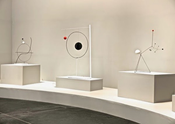
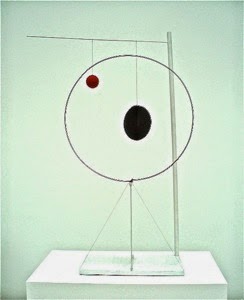
You see three of the earliest pieces in the photo above, with the fascinating Object with Red Ball (1931) at the center. This photo, from a different online source, demonstrates the piece's variability: the red ball and the black "sphere"— in fact two intersecting flat discs — can be positioned at various points along the horizontal rod from which they hang. The piece is a study in spatial relationship, implying motion. I like to look at it, with one eye or both, while walking slowly and smoothly past it, also varying the height of my eyes. No doubt this looks funny to other onlookers: I don't really care.

Object with Red Ball is as significant historically as it is on its own sculptural terms. It was in late 1931 that Calder began homing in on the idea with which he's most generally associated, the gentle movement of various components of his hanging sculptures as they respond to drafts and breezes. His friend Marcel Duchamp gave them the name that's stuck: mobiles. I think we tend to concentrate so much on these kinetic mobiles that we tend to forget their source; the three pieces in the photo above clearly put the Calder of the late 1920s and the first year or two of the next decade in a Surrealist context, particularly associating him with the Catalan painter Joan Miró.

It's easy to think of wit, even whimsy, as the primary effect of these pieces; but it's interesting, I think, to contemplate just what wit (and even whimsy) consists of, just why it should be a significant, even serious component of "abstraction." The beginning, for me, lies in the humor inherent in the sheer physical presence of these objects, made of shapes and substances that are familiar enough, that are combined and integrated in configurations never before seen, that contrast the frailty of their means and substance with the evident permanence of their purpose. These pieces mean to stay. They are here for a reason, however intuitive Calder's method may seem to be. Calder states (via one of a number of intelligent wall-readouts):
The basis of everything for me is the universe. The simplest forms in the universe are the sphere and the circle. I represent them by discs and then I vary them. My whole theory about art is the disparity that exists between form, masses and movement.
Demoiselle.jpg
Le Demoiselle, 1939
©2013 Calder Foundation, New York/Artists Rights Society (ARS)
Throughout the 1930s Calder developed a conversation, through an amazing amount of work, between stabiles and mobiles, relatively conventional free-standing sculpture and the continuously more graceful, floating kinetic pieces. The individual pieces making up these works increasingly drew inspiration, I think, from Nature: leaves, feathers, wings. Calder had joined the expatriate American movement in Paris in the 1920s, and, though he returned to Connecticut in 1933 and didn't open his French studio until thirty years later, he seems to have developed an intrinsically Gallic style. If his earlier work aligned him with Miró, it's hard not to see the work of the 1930s as somehow aligned to Matisse.

Calder's titles are almost always delightful, and delightfully apt. La Demoiselle (I don't know why LACMA's cut-line gives the word a masculine article) is redolent of the crisply feminine fashion-world of 1930s France; it is also both witty and graceful. A mobile hangs from the red stabile base, marrying the kinetic and the stationary — perhaps that's the reason for the hermaphroditic grammar of the title — but acknowledging, through its slender line and its improvised rear leg, the potential flight of even the stationary element.

The mobile had made Calder famous, rightly, and his primary colors, the wit and delicacy of his forms, the immediate pleasure of his work made it accessible. No one ever wondered what his work "meant." And if the man in the street could look at it and say "Why, my kid could do that," well, plenty of primary schools were quick to assign the production of construction-paper-and-coathanger knockoffs to children across the country — in the end only emphasizing Calder's apparently effortless mastery of what is, in fact, a rather tricky exercise in all kinds of balance.

After the war, commissions for large-scale public works began to rush in, and Calder worked away happily and productively into his sixties and seventies. This is the fiftieth anniversary of LACMA's commission of one of his most complex huge pieces, Three Quintains (Hello Girls), the grouping of three stabile-mobiles which for too long was relatively hidden at a corner of one of LACMA's signature ugly-Modernist buildings. I didn't see the piece last week, on our hurried visit to this exhibition; next time I'll be sure to say hello.

One of the most impressive of the big pieces is in fact "only" a maquette for an enormous work placed in Grand Rapids, Michigan: La Grande vitesse, over forty feet high, Calder red, massive, strong, yet lyrical. The maquette, also in plate steel, is only eight and a half feet high, eleven and a quarter feet long; but it crowds and dominates its room, inviting the onlooker to walk around and through it while allowing one to back off and take the whole thing in with one gaze. In the end, though it's forty years removed from Object with Red Ball, it similarly invites contemplation of changing configurations, and, through that, of its place — and the viewer's place — in the universe. Calder's universe, and ours.

Vitesse.jpg
Le Grande vitesse (intermediate maquette), 1969
©2013 Calder Foundation, New York/Artists Rights Society (ARS), New York, photo: Calder Foundation, New York/Art Resource, NY

Calder and Abstraction: From Avant-Garde to Iconic

Los Angeles County Museum of Art
5905 Wilshire Blvd., Los Angeles, California; 323 857-6000

Exhibition continues through July 27, 2014

Tuesday, November 26, 2013

Turrell, Francis, Hockney

James Turrell: A Retrospective. Through April 6, 2014.
David Hockney: Seven Yorkshire Landscape Videos, 2011. Through January 20, 2014.
The Los Angeles County Museum of Art,
5905 Wilshire Boulevard Los Angeles; 323 857-6000
Sam Francis: Five Decades of Abstract Expressionism from California Collections. Through January 5, 2014.
Pasadena Museum of California Art, 490 E Union St, Pasadena, California; (626) 568-3665.
WE FINALLY MANAGED to catch the James Turrell show last week while we were in Los Angeles. We'd tried to see it in September, but discovered it was expensive, and you had to book a time. This time we were prepared: we booked a convenient hour for the visit, and bought a year's membership in LACMA, which got us in free — and will get us in free to other exhibitions over the next year.

I have to confess to mixed feelings about Turrell's work. I was fascinated, years ago, when someone described to me a piece he'd made for the legendary Baron Panza: a special telescope tracked the full moon, sending its image down a polished Lucite tube which split into four tubes, each leading to a disc in a rectangular network of discs in a ceiling, above which, in a dining room, a table stood, each of its polished Lucite legs carrying the image to the table's surface, where the four full moons then appeared as optical inlays in the glass surface. 

Astounding! A work of art worthy of Raymond Roussel. Of course I don't know if it ever actually existed; but it hardly matters; one can see it perfectly in one's mind. And it is just so that I "see" Turrell's magnum opus, Roden Crater, an ancient volcanic crater north of Flagstaff, Arizona, where over the last thirty years or so the artist has been perfecting and installing a network of galleries, tunnels, windows and openings all of which are designed to mediate the viewer and the cosmos.

I visited Roden Crater a number of years ago, shortly after Turrell had bought it and begun the preliminary work of "perfecting" its contours. At the time this seemed to me a shame: one had only to walk to the rim, then down the pumicey surface of the extinct crater toward its center, to understand man's relationship to cosmos. The Arizona desert can have a magic reddish-ochre glow; the ineffable blue of the sky overhead becomes solid, forbidding, magisterial; and space, color, light, and one's physicality — one's posture and breathing — all merge into a contemplation and an awareness of infinite space, form, and weight. 

To finance his work Turrell took to making prints of his working drawings, and a number of them are on view in the LACMA exhibition. More importantly, he has made a number of installation pieces. I liked a number of the corner pieces, in which geometrical shapes seem to be projected onto the adjacent walls in a corner, their single, blinding color fields tricking the eye into seeing dimensionality that isn't really physically there.

Other pieces are huge expanses of a single color, generally unarticulated but in at least one case subtly  mottled. We sat on a bench to contemplate a few of them for several minutes: gradually you wear out your eye's receptors to that particular color, and it fades, going a curious lavender grey, but also lifting away from the plane it physically occupies and coming nearer the viewer.

There are two particularly important pieces here, but we skipped them: one involves entering a sphere in which one's completely shut off from external reality, as if in an MRI chamber, in order to be overwhelmed by Turrell's optical magic. This seemed just a bit too claustrophobic to us; besides,participation in it was sold out for the remainder of the exhibition.

The other was a large piece, a room really, which one enters in one's stocking feet, to contemplate light and color at the edge, it seems, of a yawning abyss which suggests the Cosmos itself. This does in fact work quite dramatically and viscerally, but we'd seen it at the Venice Biennale a couple of years ago, and didn't want to repeat the experience on this visit.


ALSO AT LACMA we were able to take in a a number of David Hockne'y's Cubist videos, odd films made with an array of eight or nine cameras mounted to a rack fixed to a car driven slowly through the English countryside Hockney's visited in the last few years to record the changing seasons — not only in video: also in paint, drawing, and printmaking.

If Turrell's work and vision seems touchingly Sublime-yet-innocent, Hockney's, to me, seems touchingly aspirational-for-historical-importance. Both artists seem consumed with staking a place in history, and being remembered for their discoveries and their work. Both are undoubtedly disciplined, gifted, and productive; but ultimately each seems to have been laboring at something that's obvious, that need only be mentioned for its conceptual effect to be made known. They remind me again of something Gertrude Stein once said: "If it can be done, why do it." Once the discovery is revealed, why repeat the demonstration.


Sam Francis, Sketch for Chase Manhattan Bank Mural [Study for Chase Mural]

[Untitled Sketch], 1959. Gouache on paper, 21 x 99 1/4 inches. The Museum of Contemporary Art, Los Angeles; Gift of the artist and the Sam Francis Art Museum, Inc. 93.29. Artwork © Sam Francis Foundation, California / Artists Rights Society (ARS), New York.


IN PASADENA WE SAW a retrospective of paintings by Sam Francis, and it was immediately obvious that he foreshadowed, in these canvases full of space and brilliant color, the effects Hockney and Turrell have worked at. But Francis was of an earlier generation, content merely to paint. He was introduced to painting as a therapy, while he was flat on his back for months at a time, suffering from spinal tuberculosis, looking at the white ceiling of a hospital room. I've always thought the threads of color streaking across his often otherwise empty canvases had something to do with the spots and threads you see behind your closed eyelids.

In Francis, as in Turrell, the effects of light and color seem internal as much as external; and when things really work — as they nearly always do in Turrell, but only perhaps half the time in these paintings of Francis's — internal and external merge. Or, perhaps, the distinction between them is transcended. In any case the viewer loses his sense of individuality; ego dissolves; the fact and awareness of one's individual being is dissolved in a sudden realization that it's the light and color that surround one that contains the energy and life in which, submerged, we're allowed to participate.

But Sam Francis was an Abstract Expressionist, and his best canvases have a darting, pulsing, almost violent energy that animates them with a muscularity quite lacking in Turrell and Hockney. One contemplates Hockney. and meditates in front of Turrell; one dances with Francis. There's nothing like looking at one of these big, vibrant paintings with one eye, quickly walking backward away from it at an angle, then crossing in front of it, always with the eye fixed on the painting. You're engaged by these things, they call and sing. To see the three exhibitions on adjacent days is a rare opportunity to experience an immense range of visual pleasure, but also to understand, intellectually, the inevitable 20th-century process leading from the art of painting to the art of pure light.

Friday, November 08, 2013

Diebenkorn; Erickson

Eastside Road, November 8, 2013—
I PROMISED NOT to write this month, I know, but I'd be remiss not to mention two Bay Area events worth considering. Diebkorn collage

The College of Marin is showing a beautifully installed little exhibition of a number of works on paper by Richard Diebenkorn, many of them previously not exhibited publicly: gouaches, drawings, and collages both abstract and figurative, mostly from the late 1950s and early 1960s but a few from later in his life. The work is absorbing, of course, and the gallery invites comfortable, relaxed, sustained viewing: plenty of natural light, room to step back, see several pieces at once, or step in for very close examination. I can't recommend this show highly enough.


• College of Marin Fine Arts Gallery,
835 College Avenue, Kentfield, California
September 30 – November 14, 2013
Gallery Hours: Monday through Friday, 10 a.m. to 5 p.m. and Thursdays, 10 a.m. to 8 p.m.

LAST NIGHT WE HEARD the Del Sol String Quartet play Robert Erickson's last quartet, Corfu, an expansive, eventful, ultimately very serene single-movement piece full of drones and hockets, Arabic melisma, Mahlerish introspection, and Erickson's own unique immersion in sounds. The quartet then discussed their view of the music, what it "means" to them and how they approach its performance; and they asked members of the audience to participate in the discussion.

Also participating was the artist Kimetha Vanderveen, who showed a number of small panels painted in deeply glowing pastel colors whose surfaces were rubbed and layered, investing them with a contemplative energy inspired, as she told us, by Erickson's music.

And then the Del Sol generously repeated their performance of Corfu, finding even more energy, more serenity in the work. Erickson would have been pleased with this performance, I know.

This was at the Center for New Music, a casual storefront room with good acoustics right downtown in San Francisco (and close to a good casual eatery, Show Dogs). Best of all, though: the Del Sol is preparing all four of Erickson's quartets for recording, and will present all four in concert in Berkeley's Hillside Club in a couple of weeks. I can vouch for the considerable commitment they have to the music, the care with which they're preparing it, and the skill and musicality of their performance, and I wouldn't miss this concert. Beware the webpage linked here, which contains some misleading dates and misleadingly presented information: the correct location and dates are:

• The Berkeley Hillside Club, 2286 Cedar Street, Berkeley, California; information: 510-845-1350;
Sunday 17 November 2013 at 7:00pm

Wednesday, May 15, 2013

RIP Kenji Nanao

Nanao.jpgTWO YEARS AGO or so I wrote briefly here about the painter and printmaker Kenjilo Nanao, whose studio I had visited that day, to get to know him and his paintings better, since he had asked me to write an essay for the catalog that would accompany the retrospective exhibition at the University of Santa Clara that September.

We hit it off immediately, Lindsey and I, Kenji and Gail. We didn't get together often, but we had dinner in their home — Kenji cooked at table, memorably — and again at Chez Panisse. Gail is an intelligent, deeply sympathetic woman; Kenji was a force of Nature. A samurai, as Gail says, big, bearlike, lusty, tender. Like all good painters, he sees things privately, attaching importance and poetic meaning to things you and I simply look at.

I cobbled together the essay quickly enough — there wasn't a lot of time — drawing on my memories of paintings I'd seen over the years. I had always cherished one particular painting of his, which I'd made a little sketch of in my journal when I first saw it in a San Francisco gallery. It seemed to me to be an ideal mediation of landscape and abstraction. It was almost entirely in white, and projected a kind of tranquility I associate otherwise, in works of art, only with the music of John Cage and Morton Feldman.

I reprinted the essay in my book The Idea of Permanence; it is not available, I think, on the Internet. I quote here only the final paragraph:
Comely and appropriate, searching and explorative, rooted in childhood, in youth, in maturity; traveling through time and space, tracking life energy to its most universal source, these paintings stand I think astride the Pacific, one foot in Japan, one in California, aware of the beauties and triumphs of the long history of the arts from Ancient Greece to the present, celebrating yet regretting our transient energies, always presenting, containing, suggesting the essential optimism of contemplation. There is nothing more beautiful, in all its generous modesty, than this mastery.
Kenji died on Monday. He'd been in hospital ten or twelve days, after a series of strokes culminating in cerebral hemorrhage. Gail e-mailed me quickly, asking me to write an obituary, which I set here:
Kenjilo Nanao, whose serene, lyrical paintings assimilated the sensibilities of his native Japan and his adopted California through a long and distinguished career, died in Berkeley on May 13, at the age of 84, of a cerebral hemorrhage.

Born July 26, 1929, in Aomori, in the far north of Honshu, over four hundred miles north of Tokyo — “the Oklahoma of Japan,” Nanao used to say — he arrived in San Francisco in 1960. He had wanted to study painting in France, but had trouble learning French. He became instead a Bay Area painter, influenced by the lyrical abstraction of Richard Diebenkorn and his own friend and teacher Nathan Oliveira.

He became known first as a printmaker, his erotic and realistic imagery similar to that of his friend Mel Ramos, but the Japanese sensibility, and an intrinsic love of seascape and marine light, led him to the uniquely spiritual, meditative quality of his mature paintings.

He was an influential and greatly loved teacher who contributed greatly to the growing reputation of California State University in Hayward, where he was considered a "consummate professional," Ramos says, adding "It was difficult to be an innovative Abstract Expressionist after the 1960s, but Kenji managed to dispel that myth by making wonderfully fresh paintings."

An inveterate traveler, Nanao was particularly drawn to Venice, Turkey, and his native Honshu. His work drew on these travels, on the light and space they revealed to him, and on the paintings he was able to study at first hand by such favorites as Cezanne and Titian; but it also speaks of transience and objectiviity, resolving the vulnerability of human life in the contemplation of the immaterial.

Nanao loved sweet things, colors, jokes, cooking, poker, and his family. His grandchildren adored him. He leaves, beside the fond memories of hundreds of students and friends and the beauty of his many prints and paintings, his devoted wife Gail, his son Max and daughter-in-law Chloe, and their children Zoe and Alexander.
I will miss him, but as I get older I seem to get more accustomed to these disasters. In a curious way Death draws us closer together. Some of us: those who have departed after affecting us deeply, deeply enough to have left a part of them behind in our hearts. Like Cage, Kenji affected me with his silence and his vision, his tender passion for life and his awareness of its limits and his dedication to the reconciliation that awareness demands of us. The essential optimism of contemplation.

There's a touching farewell to Kenji by Deborah Barlow on her blog Slow Muse, with a wonderful photo of him taken in his studio only a couple of weeks ago. And here's another, which I took on that studio visit nearly two years ago…
nanao.jpg

Wednesday, February 27, 2013

Kathan Brown: Know That You Are Lucky

Lucky.pngTHIS IS AN IMPRESSIVE book, and I don't say that merely because it has forced me to rethink a number of opinions I've held for a number of years — though that alone is something of an accomplishment.

Kathan Brown is the founder of Crown Point Press, the San Francisco press that has for fifty years now been printing and publishing etchings, engravings, aquatints, photogravure, woodcuts, and occasionally monotypes by some — perhaps most —- of the most significant artists working during that period, ranging from Wayne Thiebaud and Richard Diebenkorn to John Cage and Sol Le Witt.

She is also an accomplished writer. In 1976 she published her first book, Voyage to the Cities of the Dawn, a strangely moving, evocative meditation, through words and photographs, on time and perception, suggested by a trip she had taken to ancient sites in Yucatan and Central America. A number of titles followed that related more directly to various of the artists and the methods occupying her attention at the press: of those titles I know only the ones relating to John Cage.

In 2004, though, she published The North Pole, perhaps a companion to Voyage to the Cities of the Dawn: a description, with copious photographic illustration, of a voyage she took across the Arctic Ocean on an icebreaker. And now she has given us Know That You Are Lucky, her memoir of the years at Crown Point Press; of the method and mantra, you might say, of printmaking; of the exceptional men and women with whom she has worked.

In a little over three hundred pages, divided into twenty chapters, Know That You Are Lucky is a quick and compelling read: it proceeds mostly chronologically, looping occasionally when a subject warrants further consideration, then resuming the narrative. The book reads at times almost like a novel, whose characters — the artists — are sympathetic, entertaining, delightful even; and whose plot — the constant change, growth, consolidation, removals, and adjustments of the business that is Crown Point Press — is a constantly intriguing parallel to the author's speculations on art, the making of art, and the significance that surrounds it.

The book is itself a sort of metaphor of the printmaking process, which — done well — transcends distinctions of art and craft, inspiration and dedication. She quotes the psychologist Mihaly Csikszentmihalyi,
who talks about the "flow" of doing something "with intense concentration on the present," so much so that you are "too involved to be concerned with failure." … "getting into the flow" is satisfying because, once you are in it, you overcome obstacles gracefully. Obstacles enhance the possibility of flow, and eventually of creativity, which flows from "flow."
Know That You Are Lucky, p. 97


This is a good description of the printmaking process, of course; it also describes the effect of Brown's writing. The first two artists she considers at length are Cage, whose method always seems so fluent, and Diebenkorn, whose method always seems so procedural. Each in his way fully represents Csikszentmihalyi's point, intensely concentrating on the present — the moment, in Cage's case — and on the procedure, with uniquely graceful results.

Among the many dialectics in Know That You Are Lucky, which is often a very philosophical book, is one involving energy and tranquility. Again, the concept flows naturally out of consideration of Diebenkorn and Cage; but also out of the nature of printmaking, of contemplation of the Zen gardens in Kyoto, of meditations on the nature of Mayan pyramids. Brown often seems to be mulling over object, context, impingements, and extension, literally when discussing imagery or methodology, figuratively when discussing the significance and the value of art — which she does always with great circumspection, never dogmatically.

She rarely writes about critics or criticism; she rarely makes what you might call critical judgments. She follows a reference to the editor Minna Daniel, who worked with both Cage and Elaine de Kooning:
I must have mentioned that I wanted someday to write about the artists I had been working with, because later I got a letter from her with advice: "Don't, for heaven's sake, ramble," she wrote. "And, if possible, avoid evaluations, which you may want to make, but they are bound to get you into a peck of trouble."
ibid., p. 172
and then goes on to reveal, through a delicious anecdote revealing her personal knowledge of biographical information clarifying the matter, that Willem de Kooning's late work, painted when his mind was compromised, nonetheless "reflected the person I met at dinner in 1985: open, smiling, graceful, glowing, without the bitter, desperate edges shown in his paintings from earlier times."

On the next page she quotes Elaine de Kooning, who "felt a tremendous identification" with Paleolithic cave painters because they proved that "art was a very important part of the thought processes of the human race" before "we did go off into the left brain, codified, rationalized."

Twenty-five pages later we are in China, where Crown Point artists are working with Chinese printmakers, and we are thinking about rocks.
Rocks like the one in the hotel garden were considered enchanted in ancient China, I read later. Currents of favorable forces were thought to run through the earth and escape through places of beauty, which focused luck on those who were in contact with them. The Sung dynasty… hen the Chinese invented printing by creating the first woodblock prints, was also a time of high intellectual and aesthetic refinement that included the building of many rock gardens.
ibid., p. 201
Brown is slowly, imperceptibly building a persuasive argument that the making of art involves a process through which we connect to basic sources of energy and awareness that pre-exist ourselves, our society, our culture. The argument took a surprising turn, for me, when it turned to Robert Bechtle for its evidence. A characteristic image of his, of a suburban residential street, painted with Chinese watercolor on silk, was turned over to Chinese printers to translate into a wood-block print.
To the Chinese printers, not only was this an unfamiliar scene, but also Bechtle had used unfamiliar ways of placing forms tight together and unfamiliar flat brushes to paint the forms. The craftsmen at Rong Bao Zhai had carved forty-two blocks, and they were piled up on the printer's table when we walked into the shop. We handled the blocks as if they were toys, finding a bit of a tree here, a car taillight there. We couldn't keep our eyes off the proof, it was so lively. To see the cars sitting so securely at an angle on the street, to find the light on the tree so naturally rendered — the whole thing was a real achievement. The printers and carvers stood waiting. There was nothing to do but extend our congratulations.

"I really couldn't think of anything that could make it better," Bob told me later. "I found the whole thing rather emotional. There was such a powerful sense of place, and the character of the people was so strongly present."
ibid., p. 205
I quote this at length partly to present Brown's graceful narrative voice, but more particularly to explain the rethinking it has caused me to undertake. Until now I've been unimpressed with Robert Bechtle's work: the technique, color, lighting, and composition are unarguably masterly, but the imagery — the "subject matter" — had always seemed inert. Same objection to another Crown Point favorite, Sol Le Witt. But when Brown returns to John Cage — whose work I have always found meaningful and inspiring — she brings me up short, forces me to confront my prejudice.
He named [the print Smoke Weather Stone Weather ] for the weather, which, as he said, "remains the weather no matter what is going on." He said he "didn't want to have an image that would separate itself from the paper."
ibid., p. 241
Exactly. It's not a matter of imagery, of subject matter, of personal judgments about energy or relevance or inertness. The taillight, the banal street, have the intelligence and the energy of the Chinese rocks — or the rocks, for that matter, that Cage uses in so many of his prints. A few pages on Brown is telling us about the Danish artist Per Kirkeby, a geologist incidentally as well as painter, sculptor, printmaker, and writer, who
has said that painting is "the real reality" behind the "so-called reality" of our everyday experience. "We only see it in glimpses."

I understand the notion of seeing reality in glimpses, and I like the idea that Per Kirkeby (like John Cage and a few other artists we have published) has been successful in more than one line of work. But I am not sure that any one reality is more real than any other. I like looking at art, and the realities I absorb from art influence the life that I, myself, live.
ibid., p. 257
The life that Kathan Brown, herself, lives, has been devoted to both Art and Business, and her accounts of the articulating moments in the fifty-year history of her business are of great interest. Earthquake, renovation, staffing crises, national prosperity and recession, the foibles and fashions of the retail art business — these have an important place in her narrative, tethering speculations on perception and philosophy and aesthetics to "real-world" considerations of employment and compensation and community.

And no narrative of the second half of the twentieth century can neglect significant changes in the way we deal with art, reality, business, perception.
I told [the artist Brad Brown, born in 1964] Cage's story of an argument he once had with de Kooning in a restaurant. There were bread crumbs on the paper-covered table and, drawing a line around them, de Kooning said, "That isn't art."

"But," John explained to us, long ago at Crown Point Press, "I would say that it was." In his eyes, de Kooning had made the bread crumbs art by selecting them and framing them, but in de Kooning's eyes he had made a point, not art. I said to Brad that to me Cage and de Kooning are essentially incompatible. Brad said he hoped to adapt both of them to his own ends. This is different from how my generation learned to pursue knowledge. Ideas come now in bits and pieces, not in a continuum where one idea leads to another or is necessarily compatible with another.
ibid., pp. 290-91
Brown refers to Tom Marioni's idea of "a collective reality," and, a few pages later, to
The Diamond Sutra, the world's oldest printed book, [which] was found in a cave at Dunhuang. It was printed in 868. Here is a stanza from it:

This fleeting world is like a star at dawn, a bubble in a stream, a flash of lightning in a summer cloud, a flickering lamp, a phantom, and a dream.
ibid., p. 301
She quotes the photographer John Chiara, who says of his long-exposure work with a huge camera he invented and built for himself, "There's a noise in the process that I think is revealing and meaningful… It's like the failure of memory."

She wonders, near the end of this haunting book,
In 2012 we are only slightly into our new century. What does each of us need to know in order to survive as long as possible, however tenuously? Is three a common denominator that artists are searching for? If so, could it be, as Laura Owens has said "an aura of acceptance of whatever has happened"? Could it be hopefulness?
ibid., p. 307
which returns us to a quote she presents near the very beginning of her book, from Montaigne: "The most manifest sign of wisdom is continual cheerfulness."

I have quoted very extensively here from Know That You Are Lucky; this is less a "review" than a "reading through," and I hope Kathan Brown won't mind. The book contains much that I haven't touched on, of course. To me it deserves a place next to Carolyn Brown's magnificent memoir Chance and Circumstance, which I touched on a year or so ago here but have yet to deal with properly. (Perhaps one day.) Memoir is by its nature retrospective and even, in these two books, a little bit valedictory — though I wish these authors long futures; they still have things to tell us.

As I've said in other contexts, one of the most impressive things about their work is its great generosity. Long careers, full lives, great dedication, methodical application, vision, insight. Wisdom beyond words.

•Kathan Brown: Know That You Are Lucky. 376 pages; index; forty-seven color plates.
San Francisco: Crown Point Press, 2012; ISBN 978-1-891300-24-0

Tuesday, January 01, 2013

Richard Diebenkorn at Crown Point Press

Diebenkorn.jpg
Eastside Road, January 1, 2013—
THIS ISN'T MUCH of a photo, I know; I snapped it quickly with my iPhone; I just want to give you an idea of the unique combination of intelligence, repose, and beauty to be seen for the next two weeks in the handsome Crown Point Press gallery in San Francisco. The Press is celebrating its fiftieth anniversary this year, and this is by way of the opening celebratory exhibition, and who more logical to feature than Richard Diebenkorn.

The first time I saw a Diebenkorn print it was one of the series of drypoint etchings he made at Crown Point when the studio was in Richmond. I'd driven out there to pick up one of the prints to deliver to KPFA-fm, where I was then volunteering, so this must have been before summer 1964 when I went on staff. The etching was to be photographed somewhere for use as the cover of the program guide, which in those days was a small-format biweekly. I remember the print was a tabletop still life with a pair of scissors.

These were, I think, among his first prints: until then he'd been almost exclusively a painter and draftsman, alternating between representational imagery and the marvelous spatial abstract "landscapes" of the Berkeley and Albuquerque series. Later still, of course, he famously left the Bay Area for Santa Monica, where he settled in Ocean Park and painted the magnificent geometrical abstracts that went by that name.

In this photo you see three objects (excluding the partially captured objects left and right): a chair Diebenkorn left behind in the Oakland studio he used for a few years, which Crown Point subsequently occupied before moving to its present San Francisco location; a small framed self-portrait; and "Green," a magnificent etching from 1986. The paper hanging on the right-hand side of the photo, only partially seen, is a working drawing for "Green." I find this installation truly arresting, yet serene. The empty chair — I'm sorry the idiotic Republican convention last summer has spoiled that phrase for the time being — the empty chair positioned under the self-portrait brings the artist himself into the gallery, in a ghostly way, sitting (rare for him: I always think of him as standing, with the slightly stoop-shouldered powerful stance of a tall, well-built man), contemplating the working drawing, then the finished print.

In March it will have been twenty years since Diebenkorn's death, just short of seventy-one, of complications from emphysema, according to the Wikipedia entry. He had recently moved from Ocean Park back to the Bay Area, to Healdsburg in fact, a few miles from our Eastside Road, and his painting was as usual undergoing a considerable change in mood and appearance with the move: had he lived, we'd have a Healdsburg series perhaps, probably with a considerably different palette and content from the Ocean Park abstractions.

Three disturbing, powerful, rather enigmatic aquatints from 1992 may suggest disturbances interrupting the tranquil though extraordinarily thoughtful work of Diebenkorn's last decade. Called (by the artist) "Flotsam," "The Barbarian," and "The Barbarian's Garden — Threatened," they can hardly avoid being seen as representational and symbolic. They hang close together at Crown Point, allowing a close scrutiny which encourages contemplation of the changing forms and images, alterations sometimes subtle, sometimes less so, as the artist discovers, encourages, or suppresses edges and contours, re-configuring the light-dark balances, once even turning the rectangle the other way up. (You can see reproductions of these prints, and others in this show, here.)

Throughout the exhibition you're reminded of the essentially performative nature of Diebenkorn's work. This comes through quite literally as he alters his plates between trial proofs, or draws on them, or glues strips of tape or cut-out scraps of paper to experiment with various shapes. But it also pervades the viewer's engagement with the artist's process: a real colloquy develops, in which the time required by each stage of his work, both for its creation and for the viewer's perception of the rich content which is sometimes slow to reveal itself, the time itself becomes a fourth dimension of the work (the third being implied in all his work, which can hardly avoid being seen as landscape).

There's too much to be said about Diebenkorn and his work; this contemplation has often completely overcome me. Toward the end of his life I visited him on an assignment from a magazine that had suggested I interview him on the occasion of his move north. He was clearly fatigued; I now suspect he knew he didn't have that long to live. We spent a delightful hour talking about things, but neither of us wanted to commit to the project, each of us for a different reason. He was gracious and appreciative and very thoughtful: he was always, I think, a profoundly thoughtful man.

(Years earlier, when he had a retrospective at the old San Francisco Museum of Art on Van Ness Avenue, I interviewed him much more superficially. I mentioned his use of diagonals in his abstracts, and pointed to the crossed legs of one of his Seated Woman paintings, and he shrugged, and pointed out that one always sees the same things, whatever one looked at.)

I noticed a quote from Jasper Johns at the present SFMOMA yesterday:
Sometimes I see it and then paint it. Other times I paint it and then see it. Both are impure situations, and I prefer neither.
I don't think Diebenkorn would agree with this: or, rather, I don't think Diebenkorn would find any impurity in the situation: or, rather, I don't think "situation" is a word you could bring to Diebenkorn's participation in the activity Johns is discussing. "Situation" implies stasis, and Diebenkorn's work is constantly undergoing development, or, rather, since "development" implies improvement of some kind, his work is constantly in motion, the slow, meaning-accreting motion of contemplation and adjustment, the minute and informed change we must all accept and embrace if we are to continue to live.

There's also a lot to be said about Crown Point, and about its director, Kathan Brown, who has just published a memoir, Know That You Are Lucky, that I look forward to reading soon. In the meantime, this wonderful Diebenkorn exhibition will be up another couple of weeks, and I urge you to see it if you can.

• Crown Point Press, 20 Hawthorne Street, San Francisco; 415.974.6273; open Monday 10-5, Tuesday through Saturday 10-6.

Friday, May 11, 2012

State of mind

museum.jpg
IF YOU REMEMBER the 1960s, the saying goes, you weren't there: I remember them, and I was. What I don't remember is a lot of the 1970s, and I think I know why: I was busy. This blinding revelation occurred to me today on the top floor of the UC Berkeley Art Museum. We'd reached it the slow methodical way, walking up the ramps, working our way through a show called State of Mind: New California Art circa 1970, part of Pacific Standard Time, a multi-museum exhibition investigating (mostly) conceptual and documentary art made in California in the neighborhood of 1970.

I was more or less active as an art critic at the time, first for KQED television, later for the Oakland Tribune, and in the course of work I rubbed up against these conceptualists quite often. They were of course only one part of what I had to deal with; it wasn't always easy to convince the boss conceptual art was important. Or legitimate, even, for that matter; the lingering suspicion that it was rife with fraud and foolishness was pervasive in editorial offices. A clipping of a column by the old San Francisco Examiner art critic Alexander Fried, documenting the important Berkeley group Sam's Cafe, shows that even the critics had their doubts.

And truth to tell I think it wasn't only because of Conceptualism's marginality within the establishment press that I spent relatively little time on it. The tendency of Conceptualism, of all the versions of "process art" that were contending in those years — earth art, body art, documentation art, and various sorts of politically motivated exercise — their tendency to drown in the photographs and videos and paragraphs and pamphlets they themselves spawned and spun out — that tendency was offputting. I used to complain about critics who complained when artists did things that seemed to them, the critics, more like criticism than art, as if the critics' own territory was being impinged upon; but I see now that I felt exactly the same way, and the irritation I directed at my colleagues (and competitors) was in fact irritation with myself.

I still believe that the value in this movement, and it was a considerable value indeed, lay in its message that art lay in the doing, including in the idea of the doing; not in the discussion. Even such clearly visual art as Edward Ruscha's books of photographs — All the Buildings on the Sunset Strip, for example, which is triumphantly displayed in this exhibition — I can't help being more impressed, seized, with the thought of the photographer moving his equipment, taking up these positions, waiting for the right moment, than I am with the photographic results. Looking at Vermeer's Milkmaid, or for that matter witnessing a production of Einstein on the Beach, I'm aware of course of the monumental effort that went into the production: but I am seized with the magnificence of the result, with its depth and complexity and resolution, with its presence; and all this is involved in, and itself involves, a corporeality which (as I understand it) was precisely the aspect of art the Conceptualists were thought to be denying.

It was of course enjoyable to reminisce, wandering through these galleries. We'd prepared for it by starting downstairs in a small exhibition of hundreds, perhaps thousands of everyday things sent to the collector Robert Warner by the Correspondance Artist Ray Johnson; a great testimony to Johnson's compulsive submersion of any self-realized significance of his own genius in the jetsam of his urban and social environment, a sort of democratization and Americanization of the urges that had motivated Joseph Cornell and Kurt Schwitters. And a vicious illustration of Thoreau's observation:
Things are in the saddle, and ride mankind
State of Mind, the installation, is to the museum visitor as Ray Johnson's collectings were to Robert Warner, I think: overwhelming accumulations of texts and images produced and gathered by an insistent artistic methodology, at once intent on expression and suspicious of, cynical about the very existence of anything like "expression." And as the visual record of this movement gathers to make its curatorial point — leaving aside the artists' intentions, which are inevitably confused by the circles of recursiveness the curators and critics weave around them — as that record gathers, it inevitably produces a sort of meta-Conceptualism. To spend much time contemplating this in any serious way, to bring intellectual contemplation and analysis to it, leads to madness.

No wonder I spent the 1970s largely ignoring all this. I saw it, knew about it, enjoyed much of it, even fiddled with it myself, noting down ideas for impossible or dangerous sculptures, for projects linking Bay Area summits, for quartets in which the musicians imitate members of the audience, who will inevitably catch on and begin imitating the musicians, and so on.

defoliation.jpg
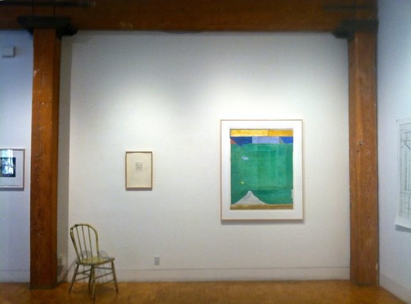
And then Lindsey, who'd been inspecting all this somewhat more attentively than I had, called out: Charles! Did you see this?

She was looking at six black-and-white photographs documenting Terry Fox's Defoliation, a work he did in 1970 for the opening of a conceptualist group show at the University Art Gallery in its lovely old Steam Room days before the present Museum was built; a piece involving his burning a design in a planting outside the gallery.

There in the photo at the lower left was a familiar figure holding a microphone to Terry's face. I was at KQED at the time, producing a show called Culture Gulch, a roundup of the arts as they were going on in the Bay Area in those days — a half-hour weekly show involving reviews, interviews, conversations and performances in the television studio or visits to artist's studios and pubic venues. Amazing, what we could do in those days; sad, that there is no physical record…

fox.jpgOops. I just fell into my own trap, didn't I? Anyhow, there's the late Terry Fox, I think perhaps as principled and pointed a Conceptualist as any of them, who intuitively understood the degrees of irony attendant on his work, his kind of art; he's gleefully concentrating on the destructive beauty and the physical enjoyment of directing his torch against that foliage; there's the Charles Shere of forty-two years ago, equally rapt at the flames and their work and meaning.

Thinking back on all this, I realize that the very marginality of my own journalistic work of those years has some resonance with Conceptualism, and with my own conflicted responses to it (and the antecedent of the word "it," here, is deliberately left ambiguous). My work for the Tribune was little read or noticed, fugitive as fishwrap. And in those days television work was similarly fugitive: no DVDs, not even videotape yet, and of what may have happened to the old film stock I have no idea at all. (Somewhere I still have a number of 35mm transparencies, and a film interview with Georgia O'Keeffe. I think.)

As Chebutykin says: What difference does it make. A question capable of being taken in more ways than one. This way madness lies. Madness, and perhaps enlightenment.

•State of Mind: New California Art circa 1970, to June 17. Tables of Content: Ray Johnson and Robert Warner Bob Box Archive, to May 20; both at UC Berkeley Art Museum, 2626 Bancroft Way, Berkeley; 510.642.0808

Tuesday, January 19, 2010

Form is how memory works

FROM THE CODGER in Corvallis comes today an envelope with a number of clippings. He pretends it's his way of cleaning off his desk; I know it's his way of keeping me au courant. In a recent phone call I mentioned my appreciation of Peter Schjeldahl's art criticism in The New Yorker, one of a great number of magazines to which we do not subscribe; this envelope contains a number of recent ones.

Schjeldahl's such a fine, fine writer. A fine critic, of course; a man who really knows how to look at art with his eyes, and then attentively follow the information that travels along his optic nerves back into a brain clearly jammed with experience, trained to consider, and allowed to reflect. You feel, reading his reviews in a magazine my west-coast taste finds often a little frenetic, a little peremptory — a curious pairing perhaps available only to an insecure culture-capital, that he's somehow above and beyond that fray. There's a mandarin ease to his writing, drawing as much from his wide and not entirely uncritical reading as from his first-hand art-looking: in both cases, his own sensibility is speaking, but with authority he's earned by closely studying that of so many others.

His sentences are beautifully formed, tending to stop just a little sooner than you'd expected. Where it is descriptive it is breathlessly, ingratiatingly evocative, and amply detailed:
Sensational colors, in particular, strain the scene of a husky young servant pouring milk, in a careful dribble, from an earthenware pitcher into an earthenware bowl on an odd-shaped table laden with a wicker basket, a loaf and fragments of crusty bread, and a stoneware beer jug.

When it adduces hypothesis it is forthright:
Echt biennial art is critic-proof, because it eschews formal engagement with past art, providing no basis for comparative evaluation.
These sentences develope cogent paragraphs whose purpose is to consider the event of the moment — a Vermeer in New York, a biennial exhibition in Istanbul — within a complex context triangulated by the conflicting, urgent, mindless demands of our own time, the long slow cultural history unfolding since ancient time, and the ample contents and motives of the critical sensibility.

I tend to read these reviews twice: once for their content; once for the sheer enjoyment of the writing. And I'm rewarded by any number of insights, usually at least one per review. The one at the head of today's blog is one of them:
Form is how memory works.
What clearer statement can there be, and what more beautifully self-illustrative? Will I ever forget how to explain the utility of form, the next time a grandchild asks?

One of the powerful engines of Schjeldahl's machinery is his insatiable curiosity as to what art is, how art works.
[Luc Tuymans] told Artnet that in his initial hours of work, "until I get to the middle of the process—it's horrific. It's like I don't know what I'm doing but I know how to do it, and it's very strange."
A lesser critic would have heard this as a comment in passing, perhaps registered it, and moved on. Schjeldahl registers it, considers it, and sets it in parallel with a thought of his own, leading the reader to an insight:
Now, that — uncertain ends, confident means—is about as good a general definition of creativity as I know. It illuminates and justifies Tuymans's eccentric work rule, with its distant redolence of Jackson Pollock's odd decision to paint in the air above a canvas.
In the air above a canvas. Schjeldahl deftly moves his paragraph away from the foreground, while keeping the foreground in view; he lifts the discussion above the present, while keeping it pertinent. His criticism fully achieves Joseph Kerman's memorable, terse definition of the practice: "the study of the meaning and the value of art works." (Contemplating Music: challenges to musicology , Harvard University Press, 1986). And it is elegant.
Oh: I want to add one thing to the comments on D.H. Lawrence, a delicious comment he makes in Etruscan Places, summing up all his attitude about the evils of Rationalist and Industrialist displacement of the vital, intuitive values of unrestrained humanity:
We have lost the art of living: and in the most important science of all, the science of daily life, the science of behaviour, we are complete ignoramuses. We have psychology instead.
The science of daily life. What a great blog title that would make!